Lets Talk More
Thank You!
Shreya Saxena
2024
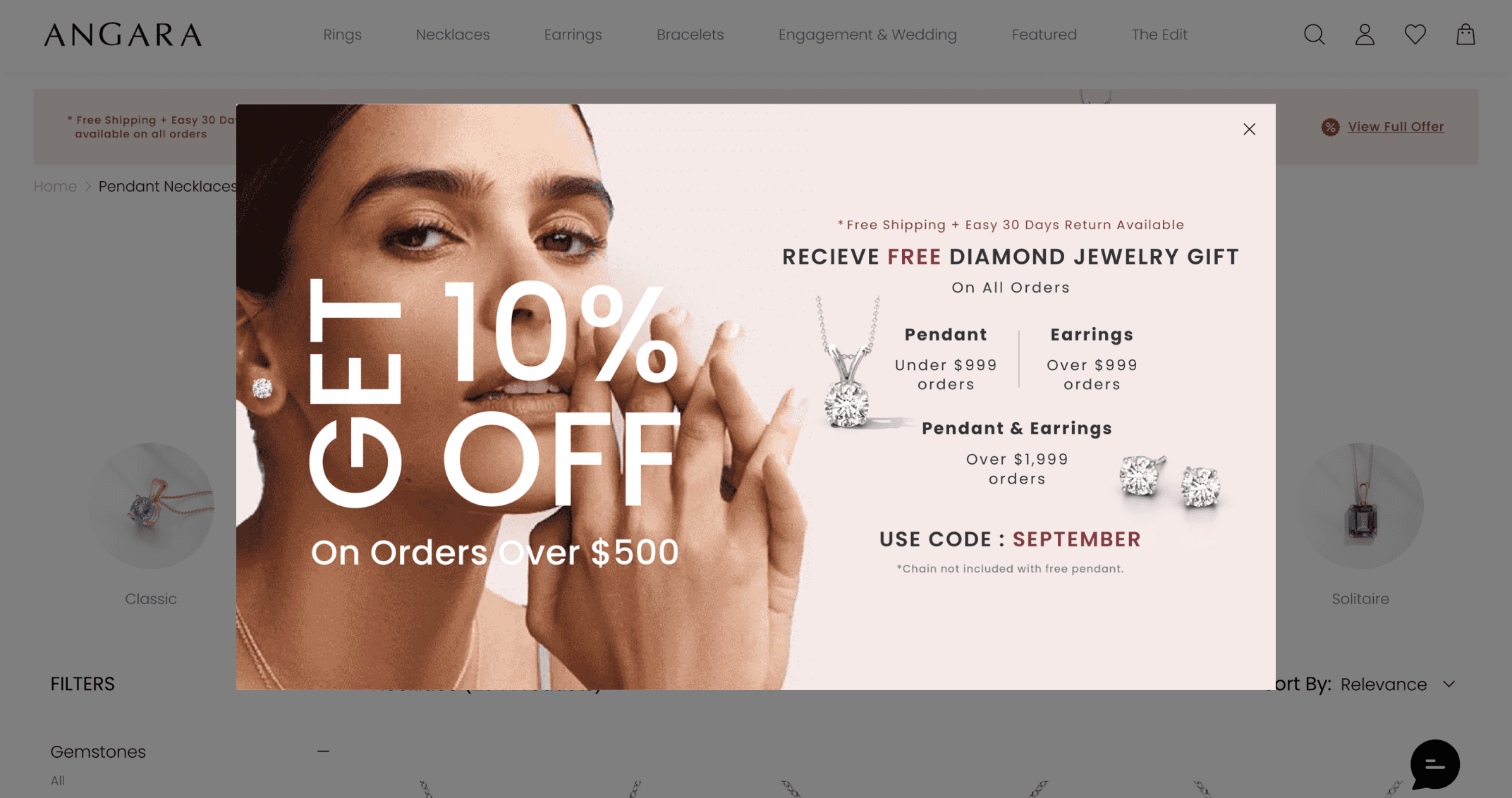
Design-C vs Original Banner

The updated Design C banner was tested against the original offer banner. Feedback from users was carefully reviewed to understand their behavior, preferences. In this test, Design C was the top choice for most users.


Testing Banner Design-C vs websites live banner
Building on the success of Design B, we developed Design C, an enhanced iteration shaped by user feedback. Design C was then user-tested against the site's original banner, and user responses were recorded. This second user test followed the same structure and methodology as the first.
Design C - Desktop Adaptation
Simultaneously, explorations were conducted for desktop screens to ensure a seamless design experience across all devices.
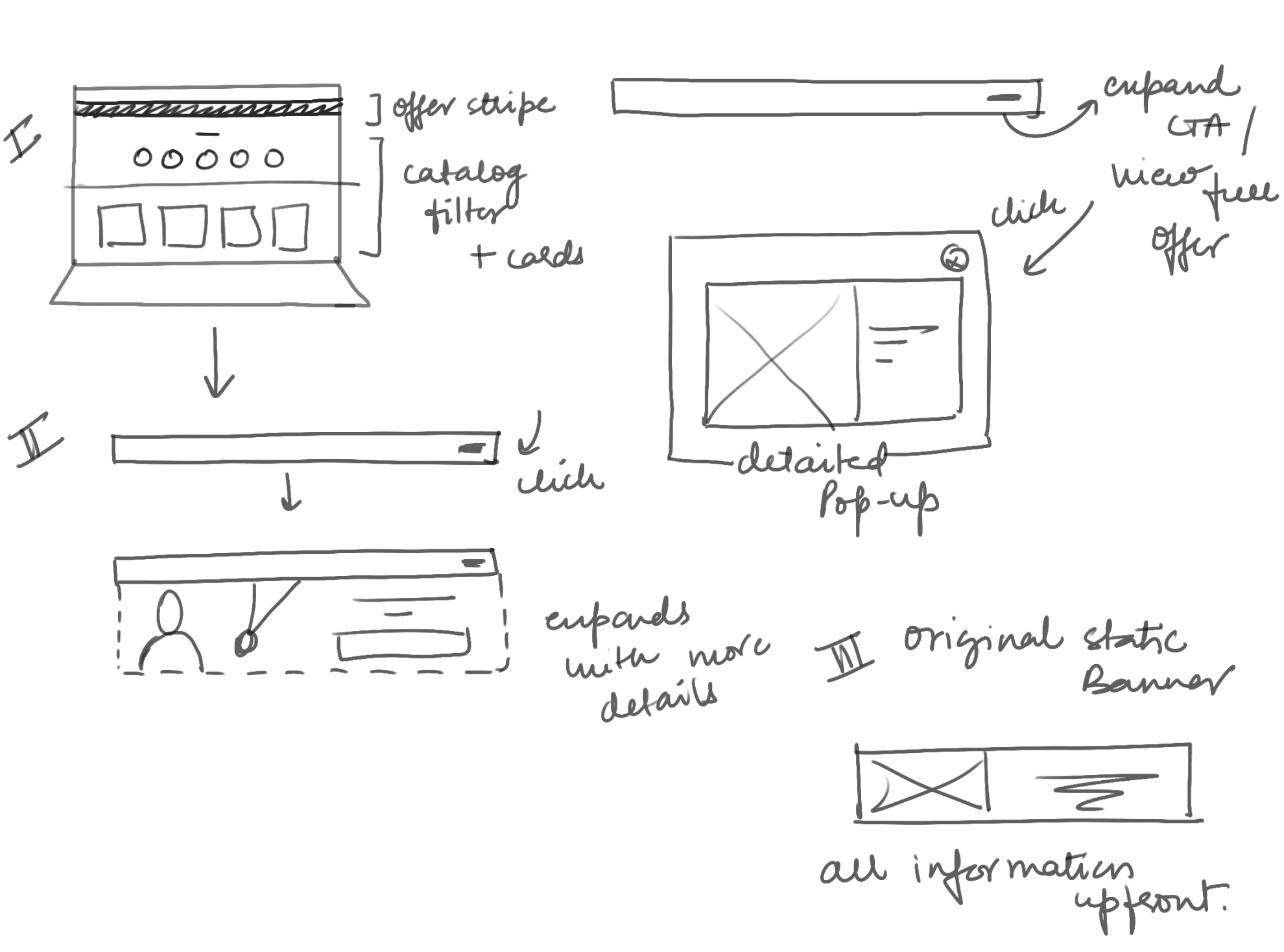
“Offer Banner” Iteration Process
Created a board to compare how competitors represent offers on mobile devices, with a focus on evaluating Design B.
Evolving Design - By Iterations
User Testing-1 Outcome
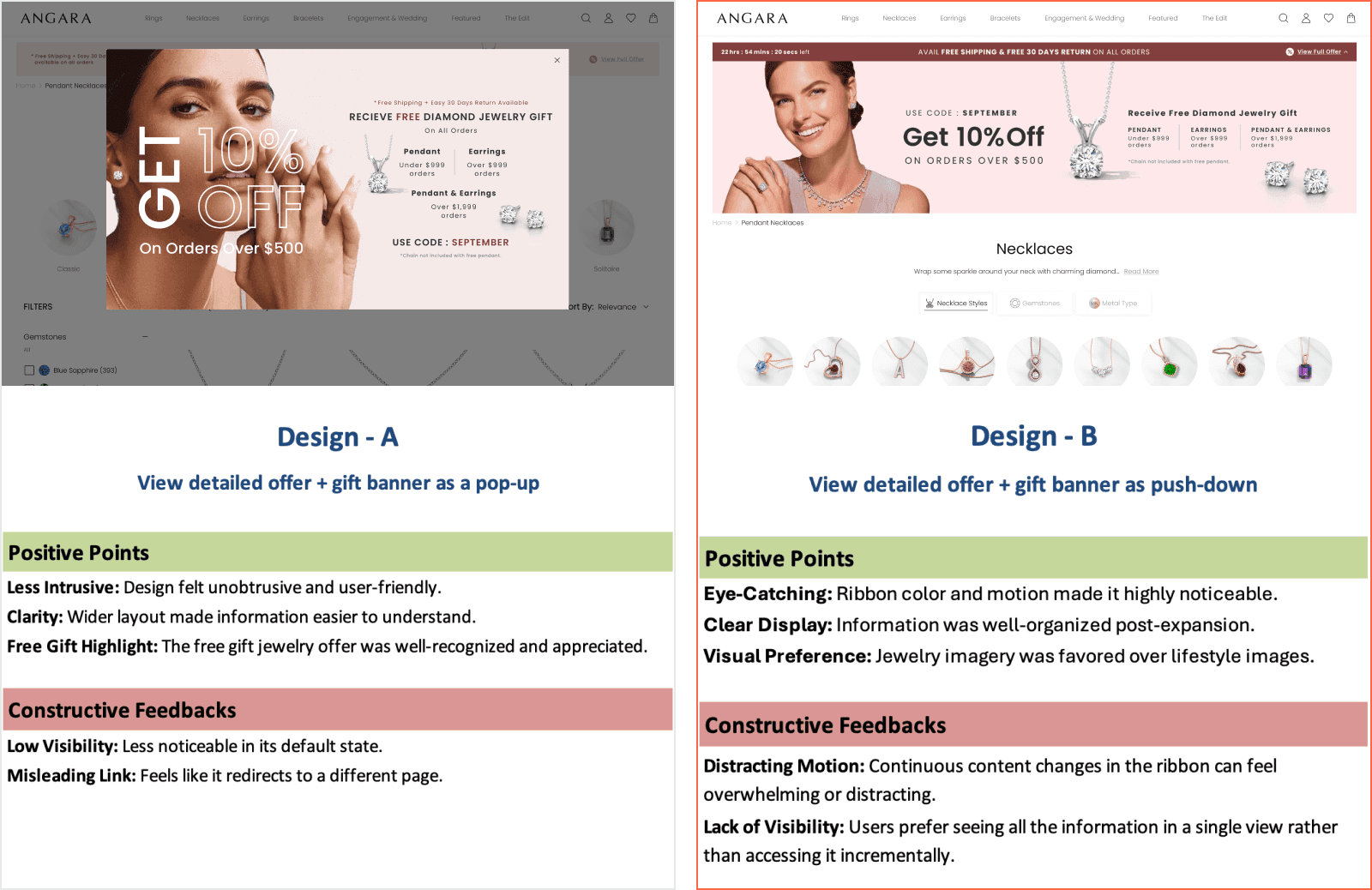
Design B - Running ribbon expanded into a push-down banner


Banner Design - B (Push-down Banner)
Design B: A dynamic offer banner presented as a running ribbon, also aimed at minimizing information overload during the initial interaction. This ribbon design featured key details and included a CTA that expanded the ribbon into a push-down banner, revealing additional information about the offer and free gifts.

Sketching Initial Thoughts
Pop-up with comprehensive “Free Gifts” Details
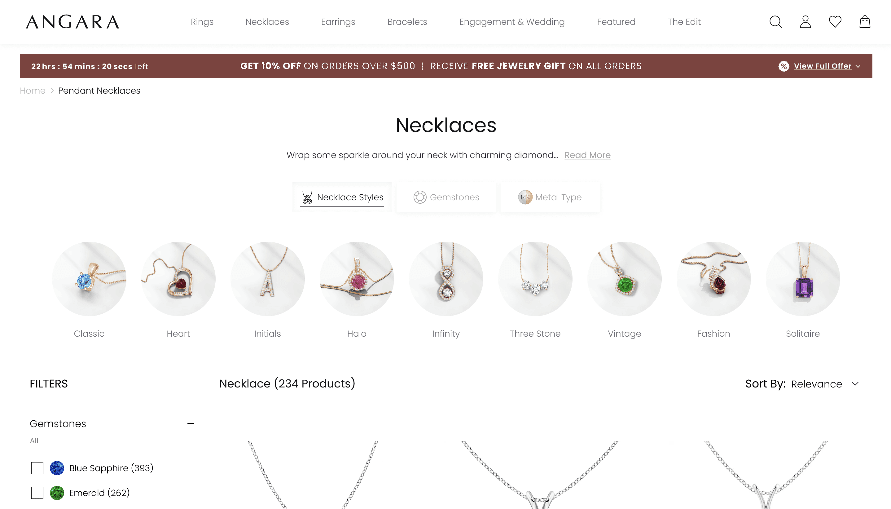
Design A - As viewed on Catalog Page on Desktop
Design A - As viewed on Catalog Page on Mobile
My Role
Lead UX Designer
Visual Designer
Timeline
Aug 2023 - Dec 2023
Introduction
In e-commerce, offer banners serve as critical touch-points to communicate promotions, discounts, and value propositions to customers. This project focused on redesigning and testing offer banners to understand how the brand's target audience perceives various design elements and messaging.
Offer Banner Design and Testing - “The Power of First Impressions”
Problem Statement


My design process for this project started with discovery and problem definition, focusing on understanding the offer banner's primary purpose: effectively promoting the offer and optimizing engagement.
I delved into audience behavior, preferences, and expectations to ensure the design resonated with their needs, followed by mood-boarding and brainstorming to explore creative possibilities.
The final steps involved visual design, usability testing with real users, and performance testing to identify the most impactful design. Each phase ensured a user-centered approach, balancing aesthetics and functionality.
My Process
Catalog offer banner with cluttered and poorly communicated offer detail option
Objective
Evaluate Audience Perception: Understand how the target audience perceives different banner designs and messaging.
Optimize Engagement: Test various design layouts and interactions to identify elements that maximize user engagement.
Promoting Offer: Promoting the current campaign and free gifts offered.
Visual Design
The collected information was utilized to create initial banner designs using graphic software like Photoshop and Illustrator. The two initial banner concepts were:

Sketching Initial Thoughts


Mood-Boarding


Explored various approaches to address the problem, focusing on innovative ways to present relevant information effectively. Additionally, incorporated interactive elements to provide users with immediate feedback, enhancing engagement.
Brainstorming Banner Designs
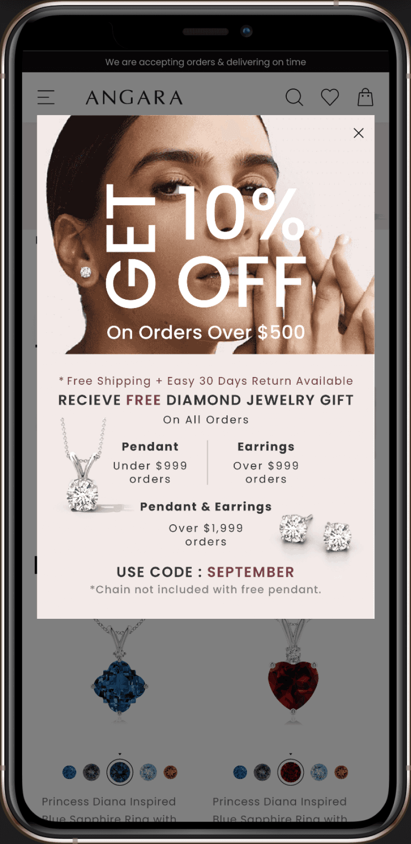
Banner Design - A (Pop-up Banner)
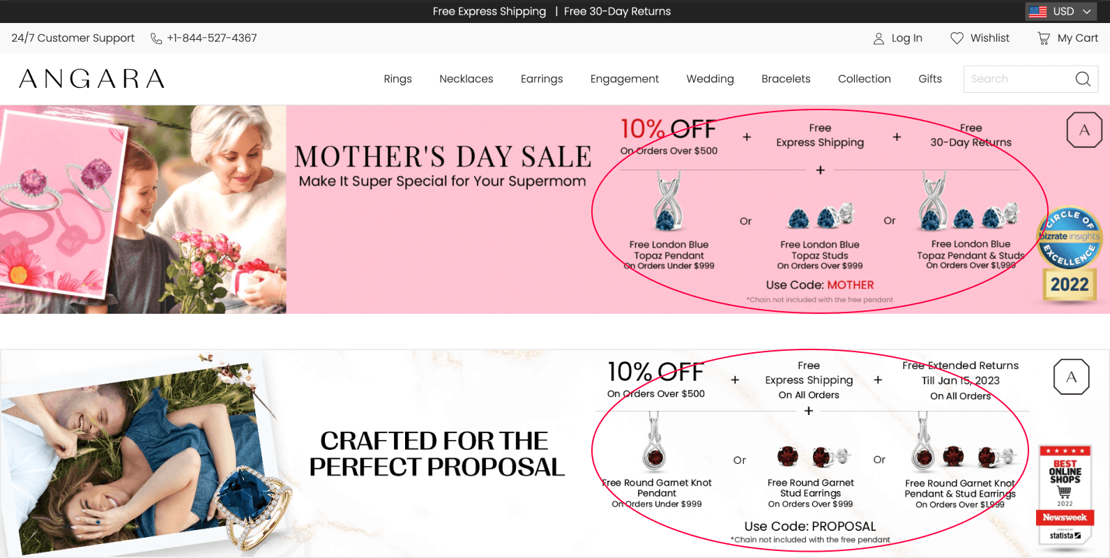
Design A: A narrow banner designed to reduce information overload during the first interaction. It displayed essential details and included a clear call-to-action (CTA) that triggered a pop-up, offering more comprehensive information about the offer and free gifts.


Design B - Banner view on catalog page on desktop
Design B - Banner view on catalog page on mobile device
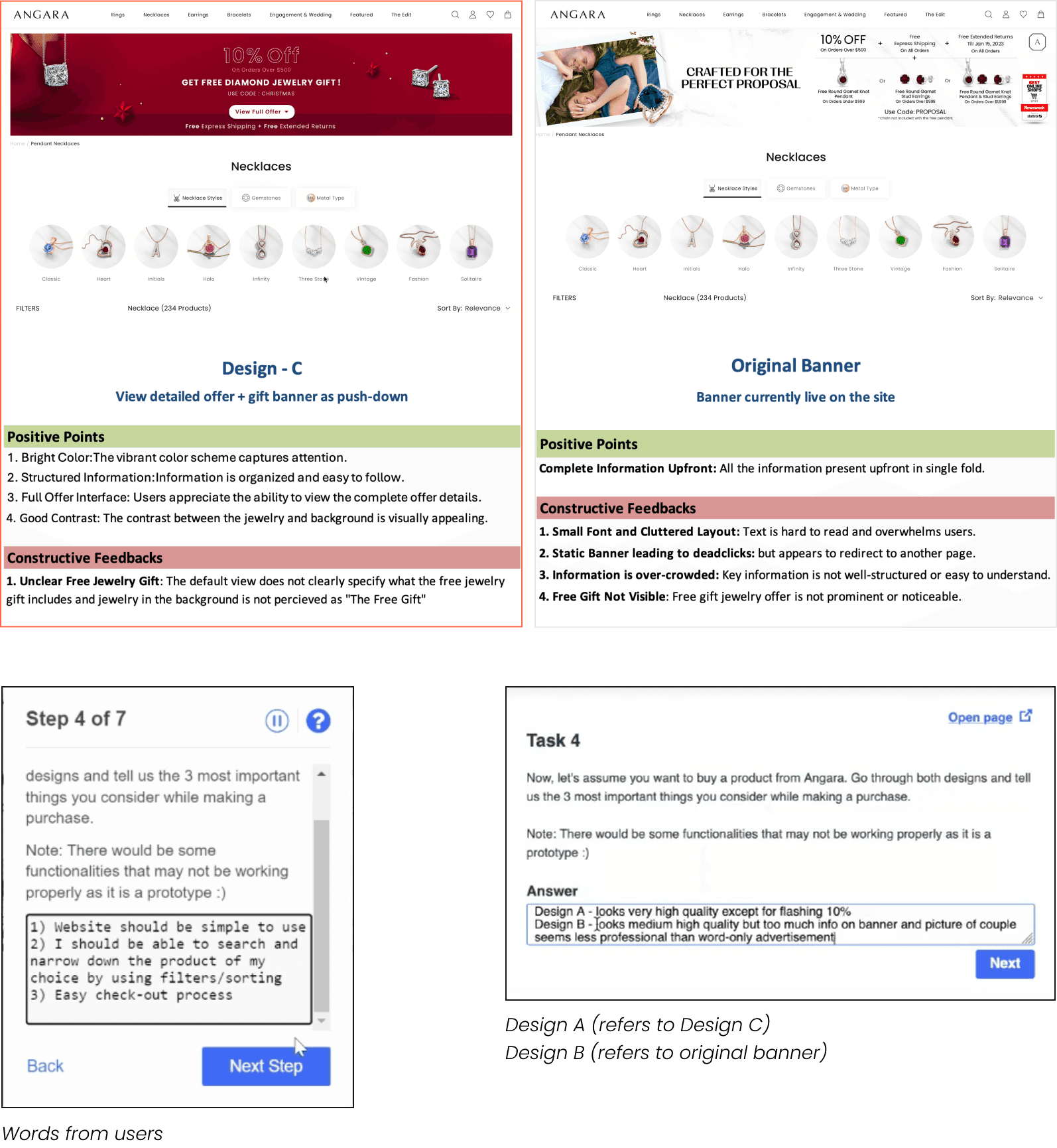
The two banner designs (A and B) were presented to users as interactive prototypes. Participants were instructed to open the banners in separate tabs to simulate a realistic browsing experience. They were guided through a structured series of tasks and questions designed to evaluate the usability, clarity, and overall effectiveness of each design.
User Testing Designs
Testing Banner Design-A vs Design-B
Once the two banner concepts were designed and prototyped, their performance was tested using UserTesting.com with 5 focus groups, each consisting of 5 users. The test was structured as follows:
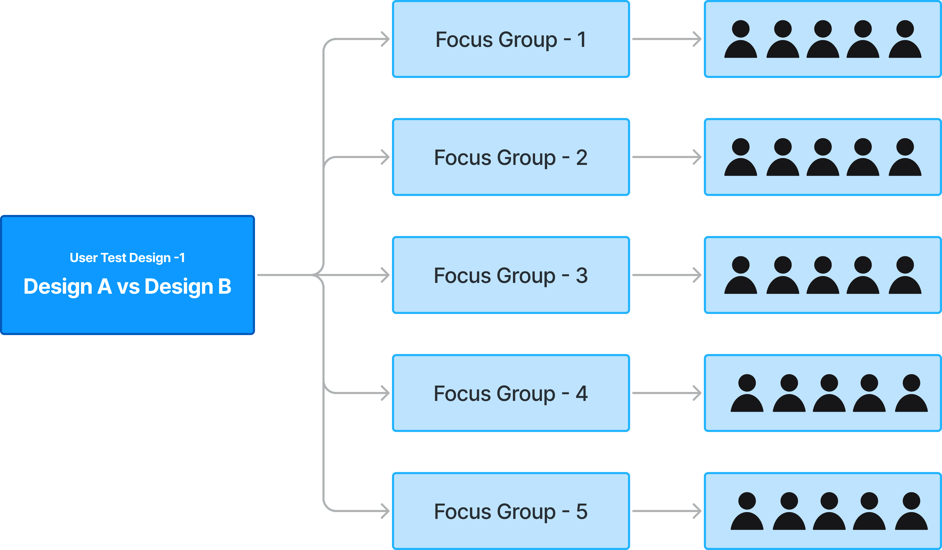
Designing a user test - With user focus groups
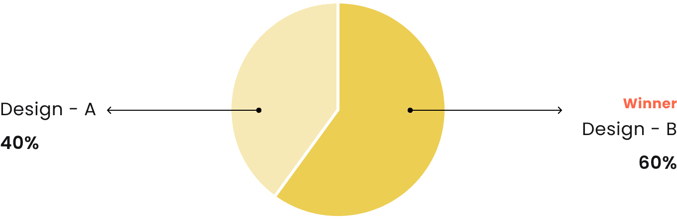
Design-A vs Design-B Outcome
Open-ended responses were thoroughly analyzed to identify patterns in user behavior, preferences, and pain points, offering valuable insights for further refinement. In this user test, Design B emerged as the preferred choice among users.
Preference for Design-B: Users predominantly preferred Design-B due to its subtle interactions, which felt less intrusive compared to the pop-up banner in Design-A.
Clearer Information Representation: Users found the offer easier to understand when all the information was displayed upfront, reducing the need for additional interaction.
Missed Interaction Issue: Some users did not interact with the banner and missed out on the offer details. This highlights the need to iterate on Design-B, potentially by incorporating a version where the ribbon itself functions as a narrow banner with all key information displayed.
Key-takeaways
After analyzing the user test results, a quick board was created showcasing banners from competitor websites to gather inspiration for potential iterations. This board highlighted the designs and strategies competitors use to present offers on mobile devices.
Using these insights, the strengths of both Design A and Design B were combined to create a template for Design C - The Design C template was further refined and adapted for a different campaign. Variations were developed by incorporating the same information across diverse visual languages, trends, and themes. This approach ensures the banner remains flexible and can be tailored to various campaigns, each with its own distinct visual identity.


Design C template - Mobile Banner Exploration
Design C.1 - Mobile Banner - Default State
Design C.1 - Mobile Banner - Expanded State

Design C.1 - Desktop Banner - Default State
Design C.1 - Desktop Banner - Expanded State
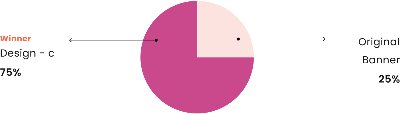
User Testing-2 Outcome
Key-takeaways
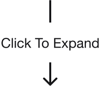
75% of users preferred Design C due to its structured presentation, vibrant visuals, and clear segmentation of information.
Push-Down Feature: Users appreciated the push-down feature, which allows for detailed information while keeping the default view uncluttered.
Advantage of Original Banner: The original banner displayed all information upfront, reducing the need for user interaction.
Feedback on Free Gift Details in Design C: Jewelry images were perceived as advertisements, causing confusion about the free gift.
Future designs should clearly label and highlight free gift details to avoid misunderstanding.
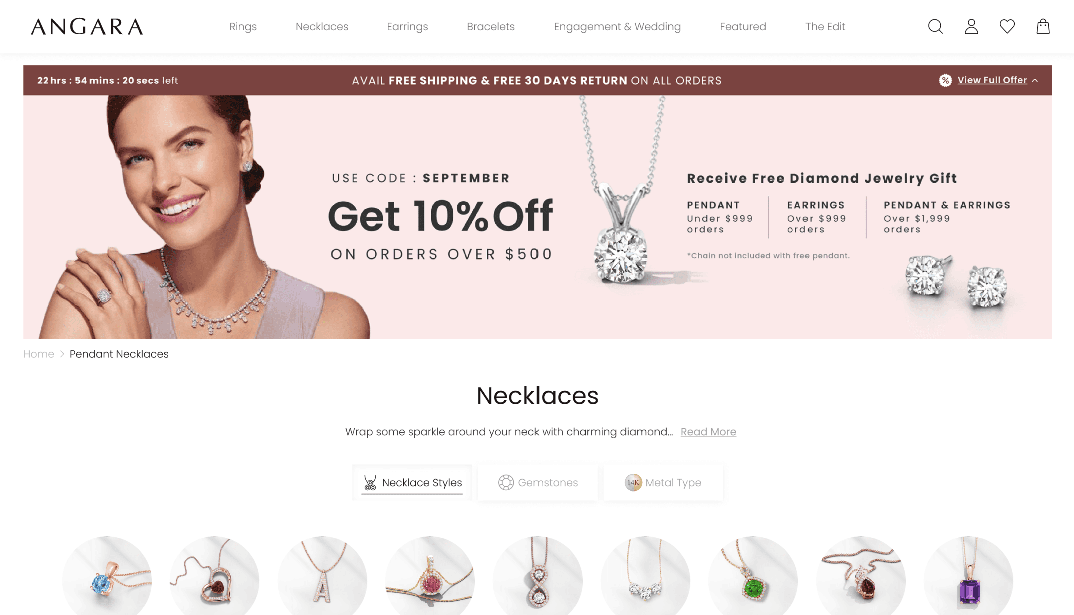
Final Banner Design
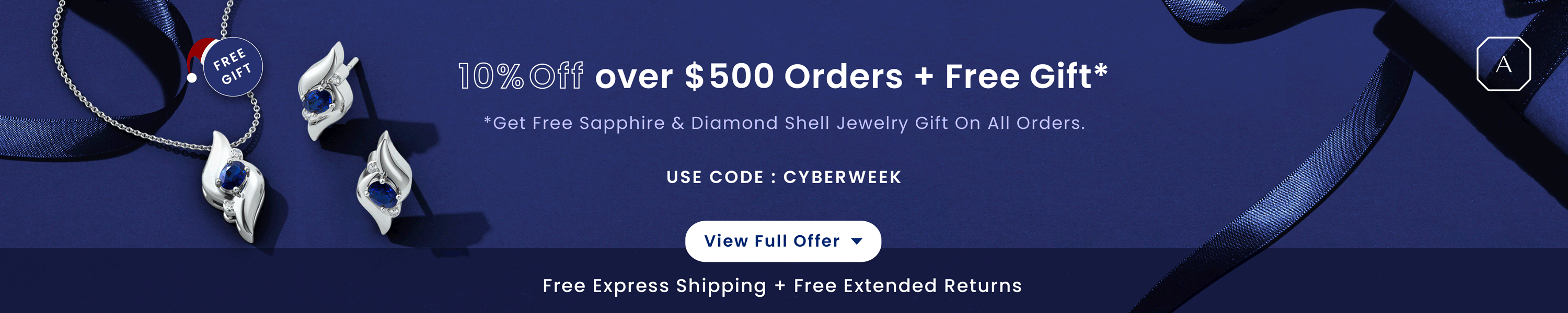
After several rounds of feedback and user testing, the final banner design, Design D, was created to be clear, engaging, and easy to use. It combines all the insights gathered during testing, with a vibrant look, clear details about the offer, and an interactive "View Full Offer" button for more information. The "Free Gift" label and product images are designed to grab attention while keeping the banner clean and professional. Design D solves earlier issues and provides a user-friendly design that works well for the campaign.
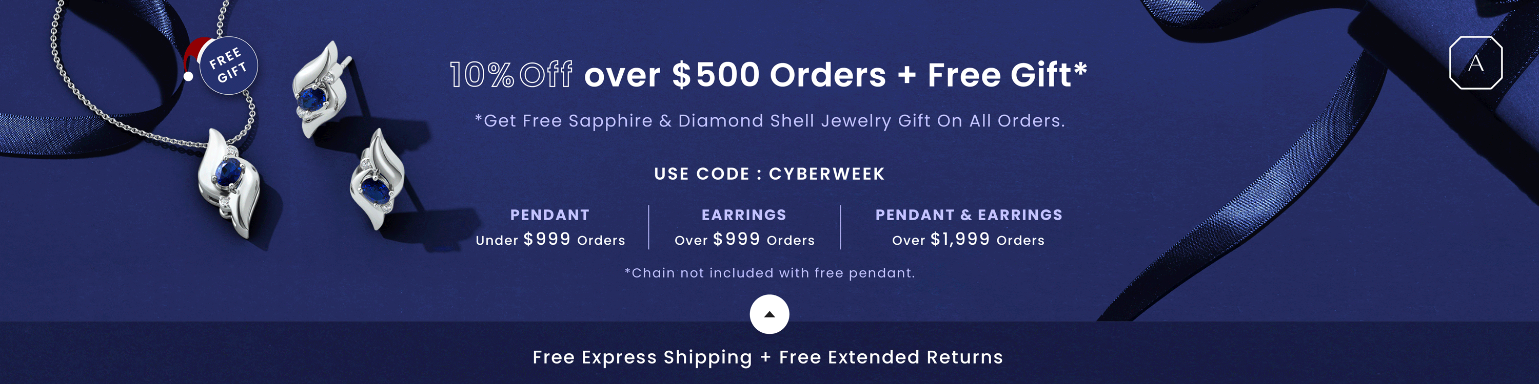
Final Design D - Desktop Banner - Default State
Final Design D - Desktop Banner - Expanded State